Prosody
(001)
- Client
- Prosody
- Year
- 2026
- Services
- Brand identity — Type system — Website — Motion
An AI dubbing brand that shows the craft rather than the technology: one variable font, four registers, and the rythmo band as notation. A self-initiated project, delivered as a live website, not mockups.
Context
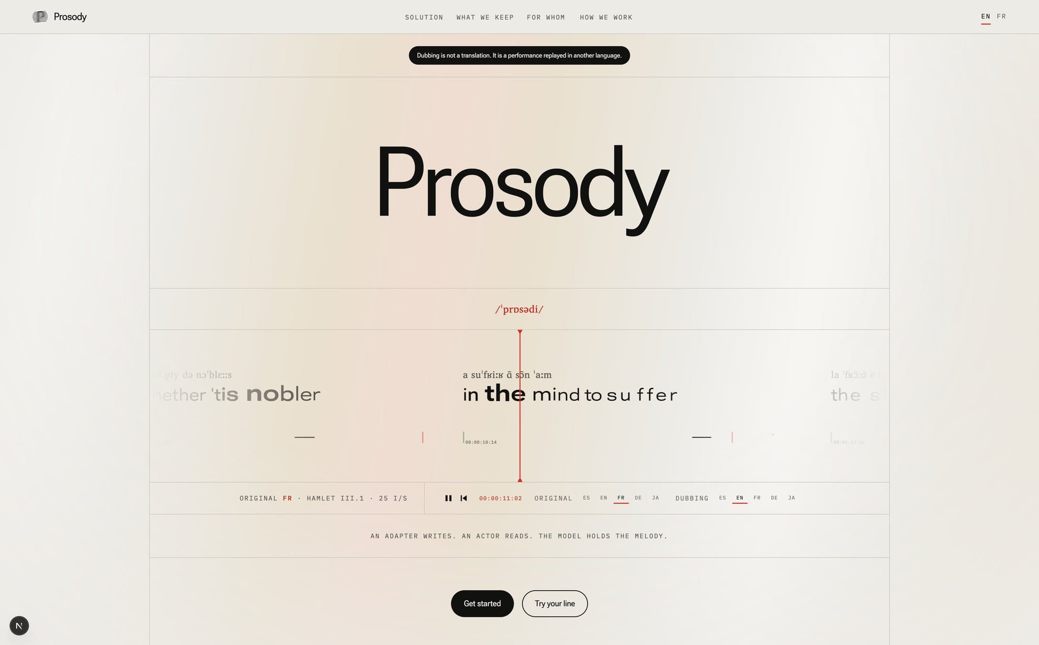
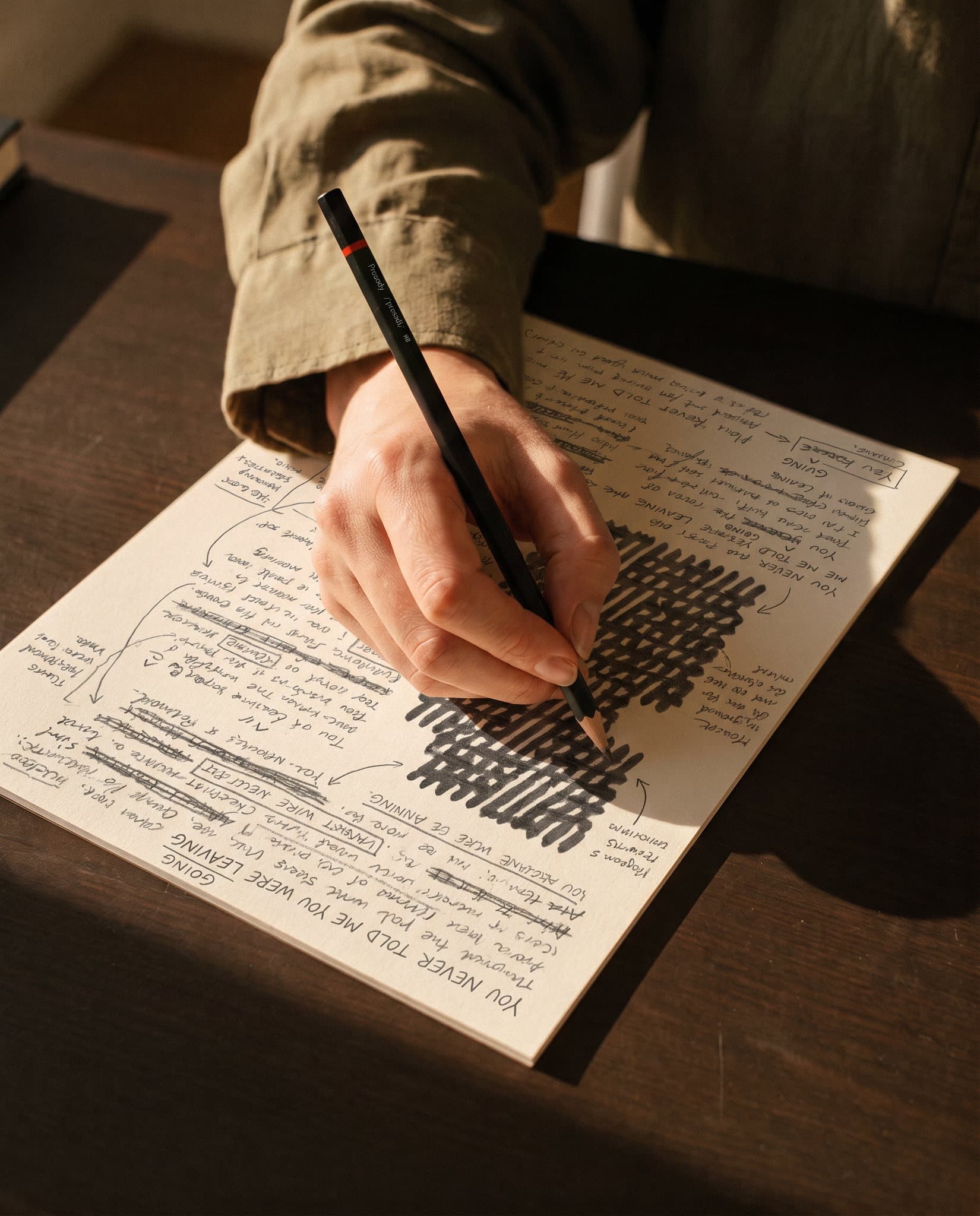
The AI dubbing category all looks alike from one player to the next: a sound wave, a purple gradient, a promise of revolution. I wanted to know what a voice brand would become if it looked like the craft it serves, not the technology it uses. The starting point comes from the studio. The text of a dub scrolls on a band beneath the picture, and the actor speaks as each syllable crosses a bar. The craft was already writing prosody with typography, it only had to be taken at its word.
Concept
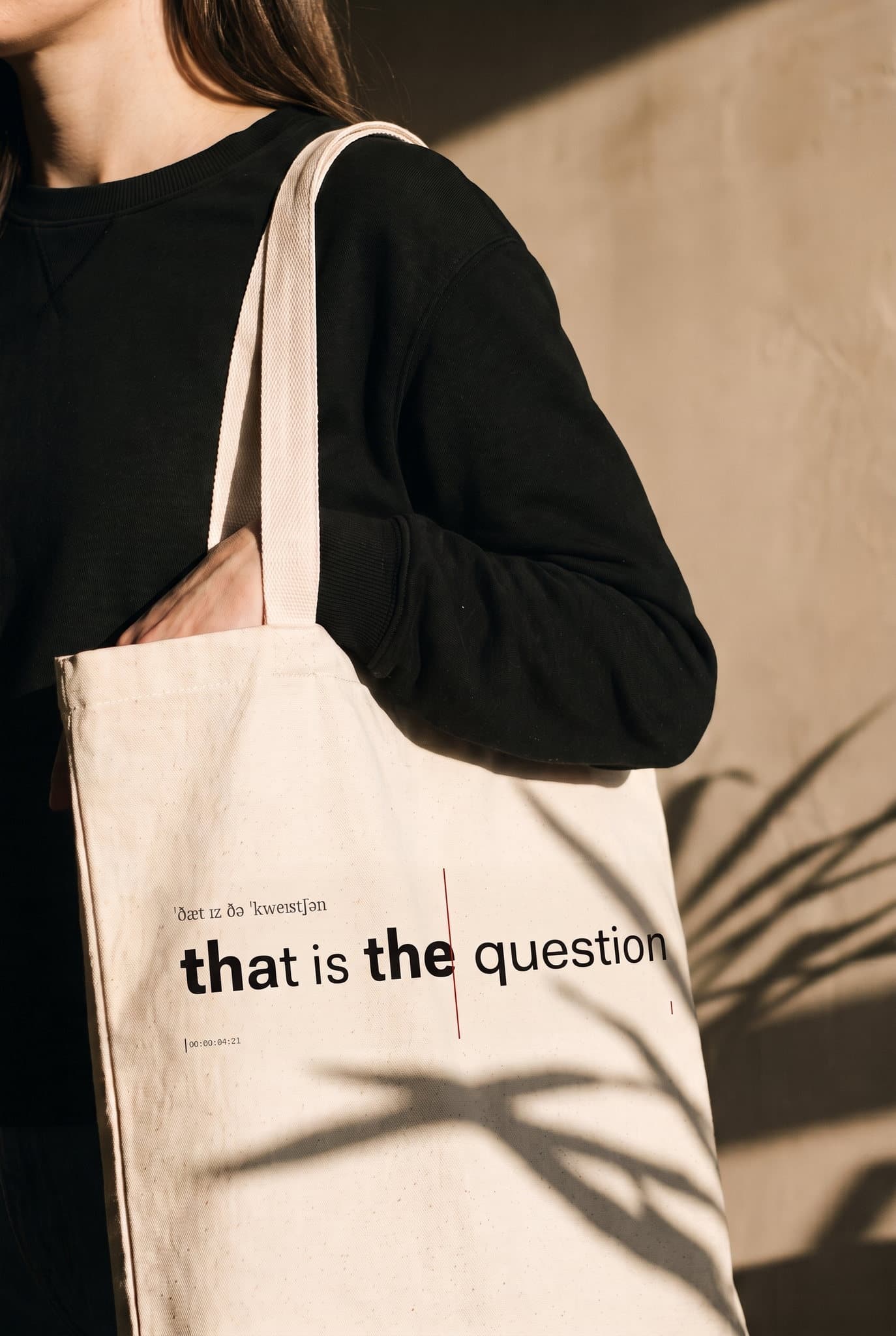
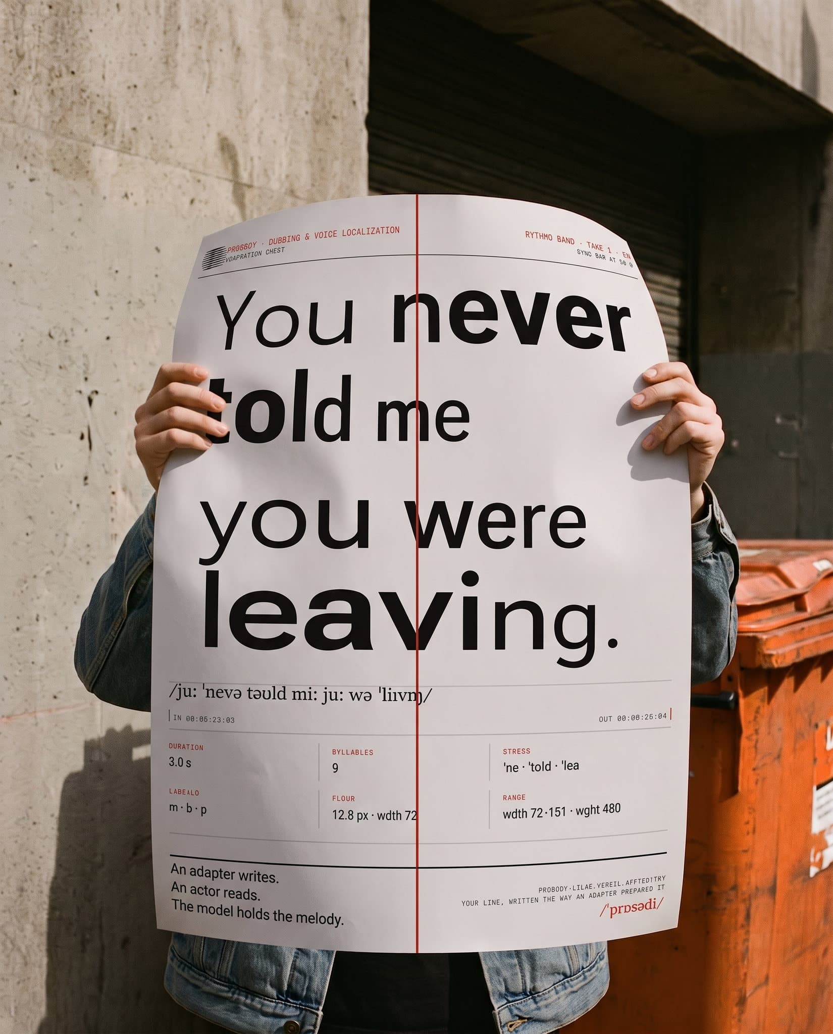
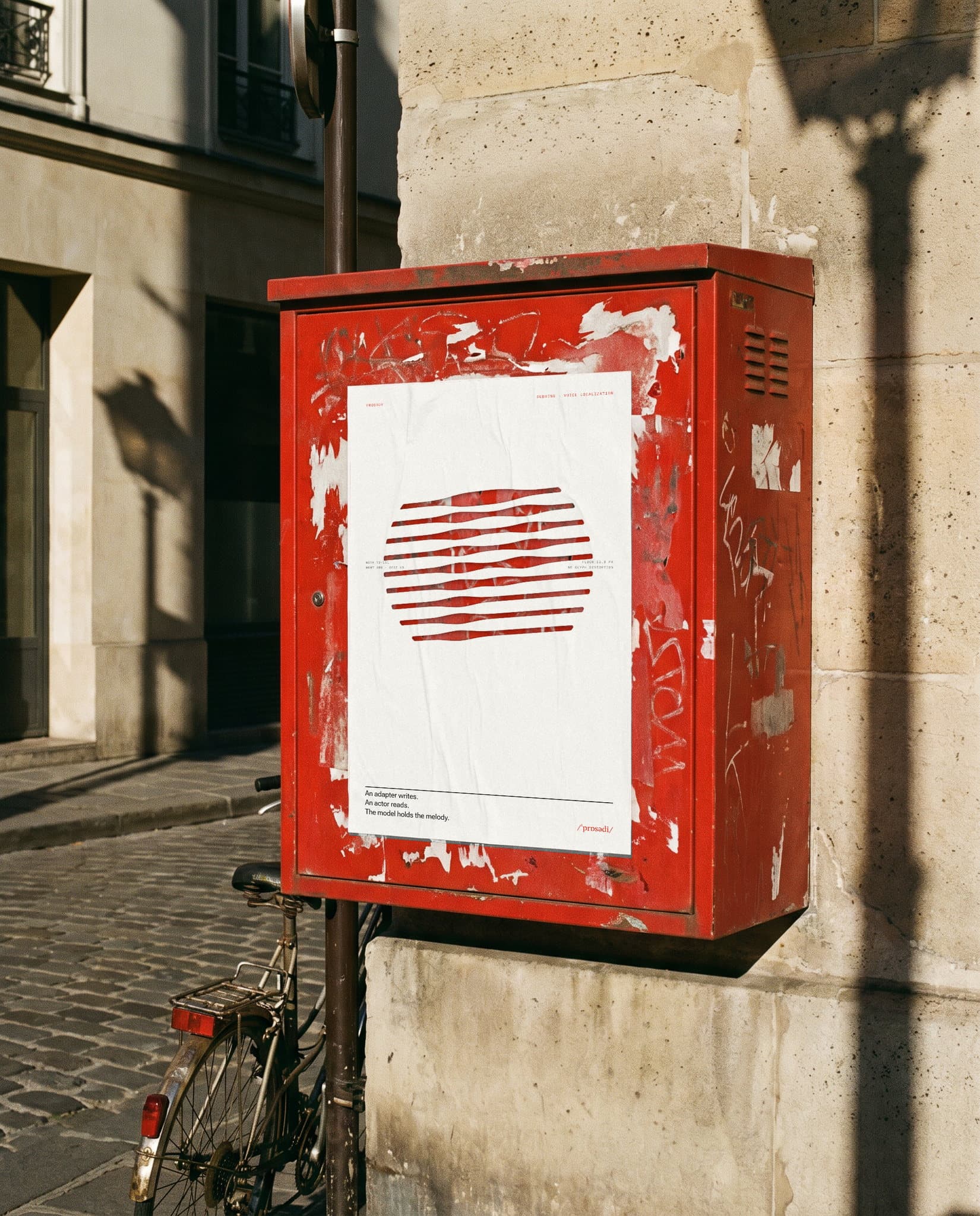
The identity rests on a simple ambition: show dubbing as a performance replayed in another language, not as a translation. The rythmo band became the brand's notation. A variable font whose width follows the timing of the line, a red sync bar, a phonetic track. It is not a metaphor, it is a typographic behaviour: words stretch when the line is slow and tighten when it is fast. Around this notation, a deliberately sober universe, ink and paper, a signal red, and a monogram read through bands that thicken inside the letter. Every distortion answers a question from the craft, never an effect.
System
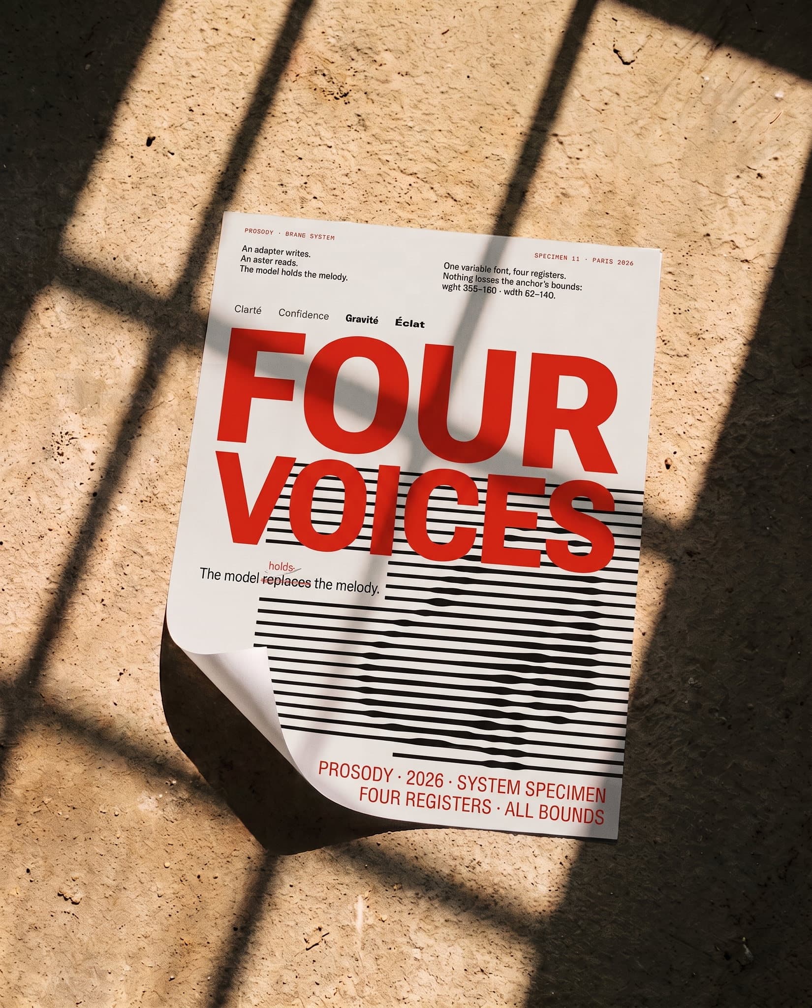
A single font, Roboto Flex, one anchor, and four registers that derive from it: Clarity for long reading, Confidence for editorial density, Gravity for commitment, Brilliance for launches. Below 12.8 px the registers merge and the system falls back to Clarity. Japanese is never distorted, only spaced. This system is public, read live from the same tokens as the site, and delivered in Figma. The site itself is the deliverable: bilingual, self-hosted fonts, a twelve-column grid that starts under the navigation and runs through every section, and “Your line”, a shareable mechanism where anyone types a sentence and sees it written the way an adapter would prepare it.
Motion
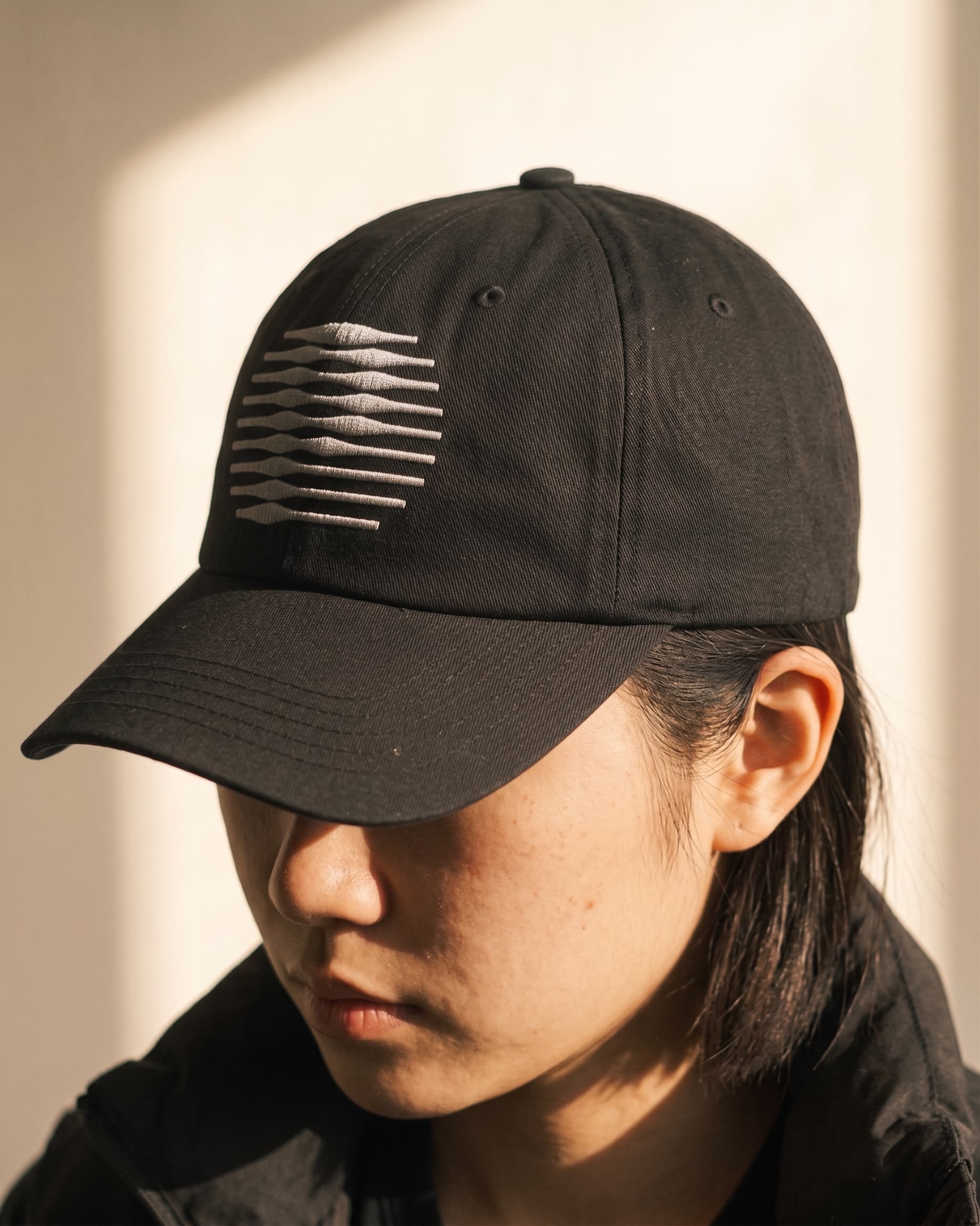
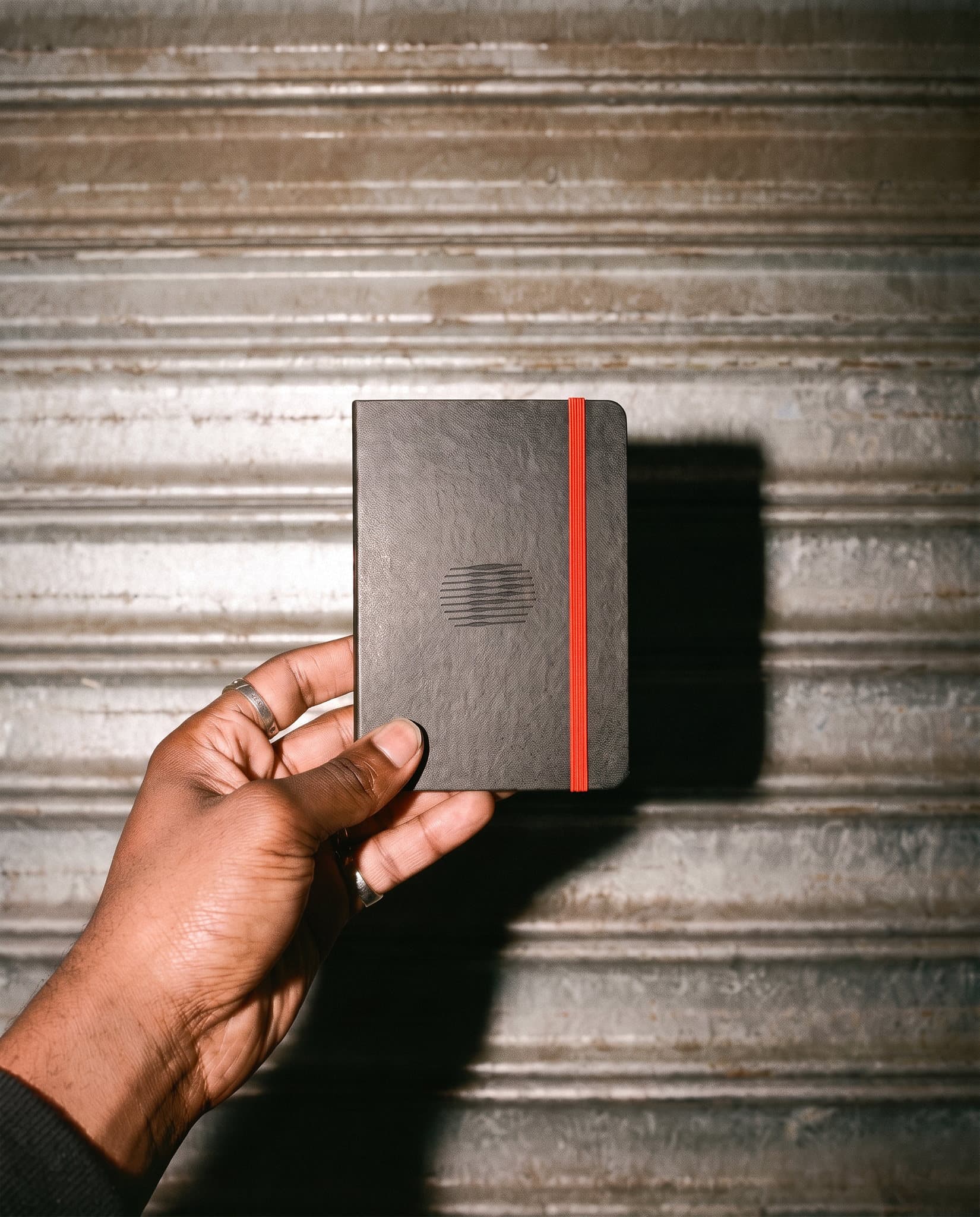
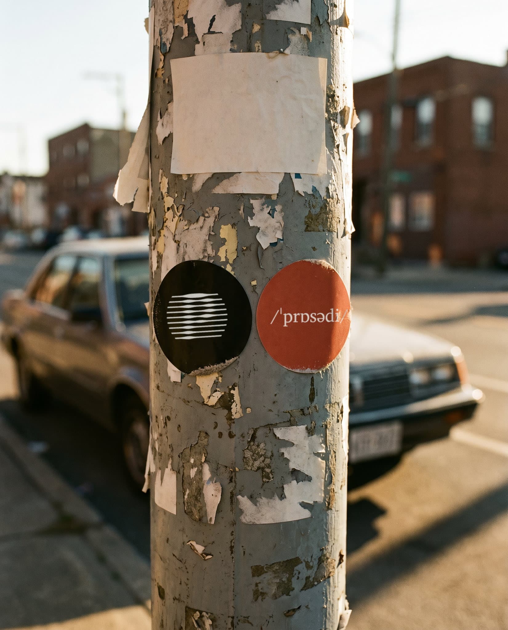
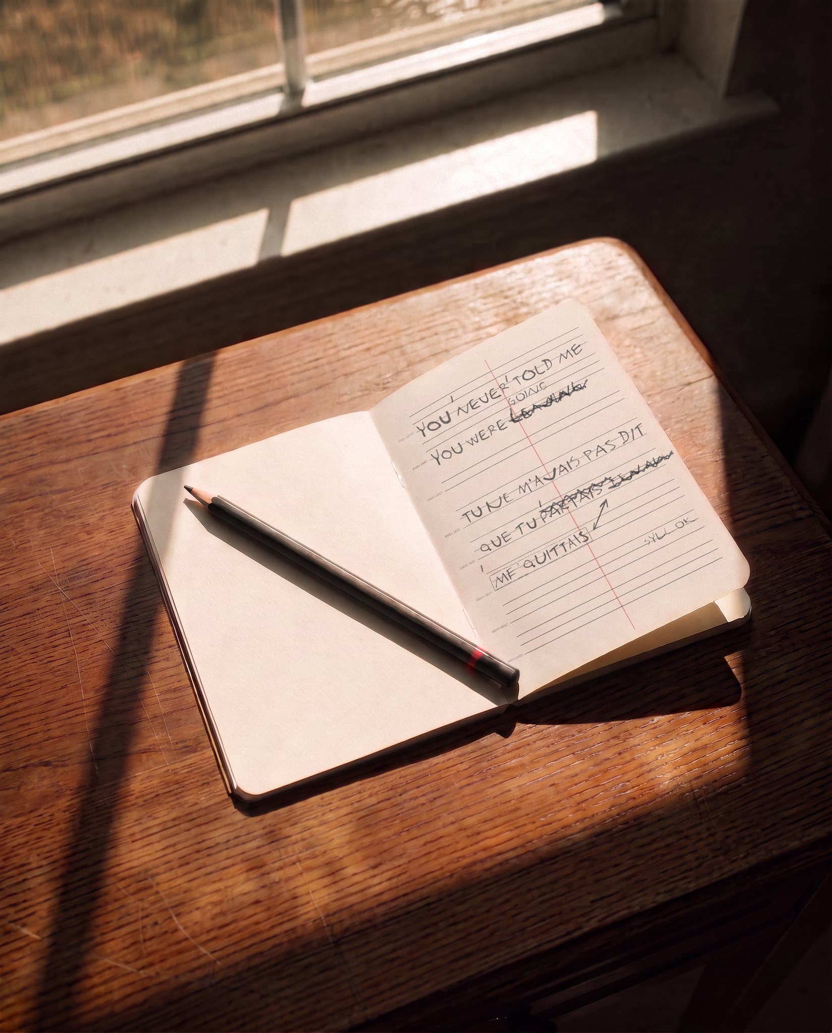
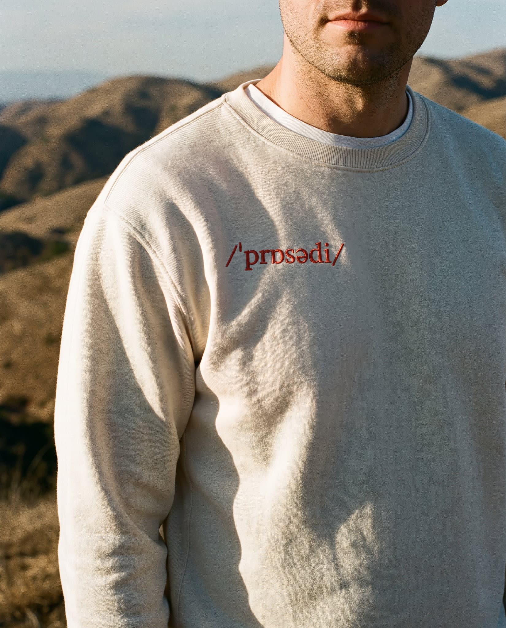
So the identity is never frozen, motion started from the gesture of the craft: the band that scrolls, the syllable that swells as it crosses the bar. The site's headings breathe on that same pattern, one line per pitch of voice, and the monogram swells on the slope like the letters of the logotype. Off screen, the concept lives in ordinary objects, a notebook ruled like the band, a sticker on a laptop, a cap in the street, posters. Normal people using a quality AI, and an aesthetic that has no need to pretend.
Credits
Client: Prosody. Sector: AI, voice. Category: brand identity, type system, website. Art direction and design: Karl-William Diboulé. Case study: fictional brand, non-commissioned exercise.